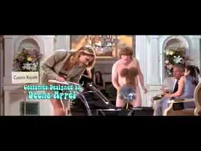
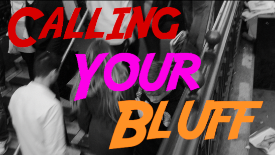
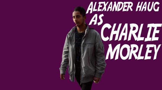
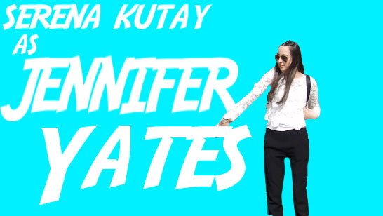
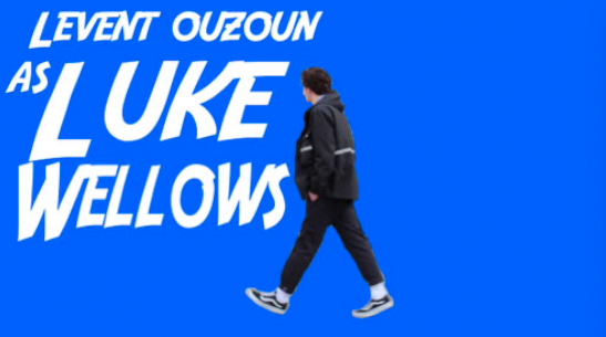
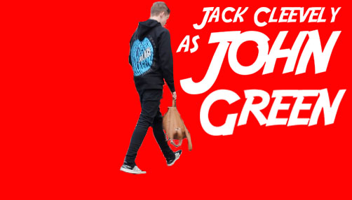
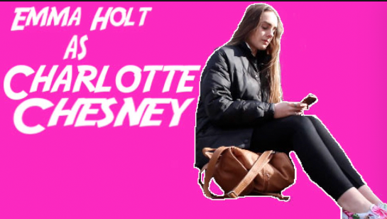
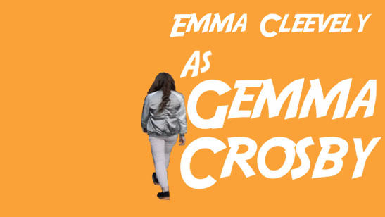
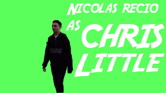
When constructing my opening titles i wanted to use bright colours that stand out against the black and whit background. I feel like i achieved this through the use of the red, pink and orange text. As well as the text taking up the whole screen i believe it attracts the attention quite well, just like the text in the opening to the film "Austin powers the spy who shagged me".
|
|
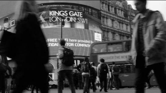
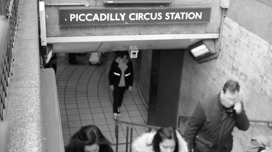
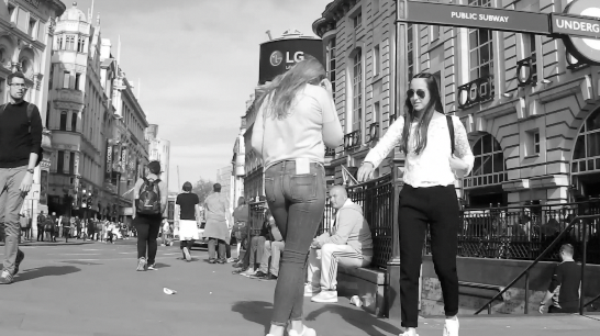
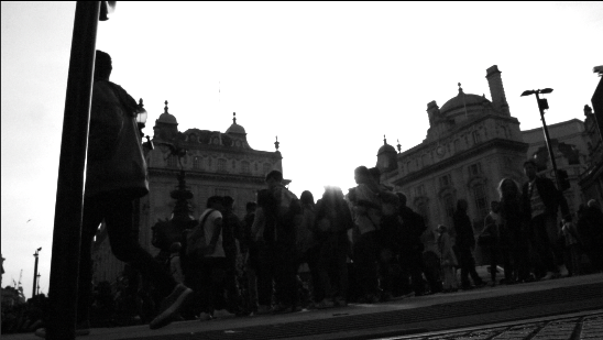
For my location i used piccadilly circus as i thought i was a iconic spot in London and very easily recognisable. Also i took on board feedback from my questionnaire which prominently said piccadilly circus was the best location. Both of the shots below clearly where we are and the location. I believe that the low angle shot on the right hand side shows the iconic advertising board of piccadilly circus and although this shot would look better in colour i believed that the tittles have more effect when everything is black and white.
|
|
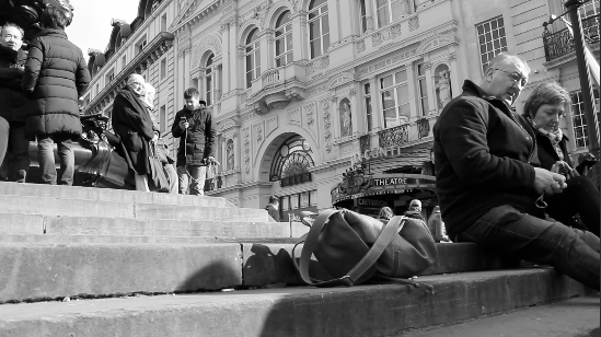
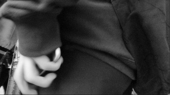
Costumes and props used where fairly basic as i didn't want anything too extravagant to be happening in the opening sequence. Props include the bag, which keeps reaccuring in the opening sequence and i quite like this, as well as a Wallet and 2 phones. All my characters costumes are very casual and basic as i wanted them all to look like ordinary people.

|
|
|
|
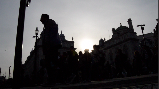
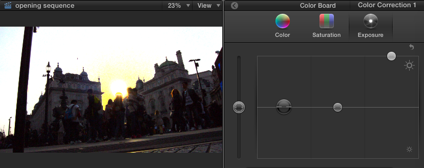
For my camera work and editing i did 3 prominent thing to my opening sequence. Firstly the whole movie is now black and white. This wasn't my original plan however i believe this really makes the tittles with the characters names really stand out more. Before this i had used colour correction to take a clip from being completely outlines with the sun glaring in the background to the clip being viewable (however now in black and white). Finally the most challenging thing i had to do was to use a skateboard for any tracking/dolly shots as i did not have the equipment available to me.
|
|
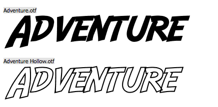
My font for my opening tittles is called "adventure" from the website Da font. I liked this font because it helps give the animated and bright feel to my movie. I introduce my characters using these freeze frames with this font. I feel the bright colours show individual personality with the white connecting them as a group. Also i feel the colour really stands out against the black and white film.
|
|
|
|
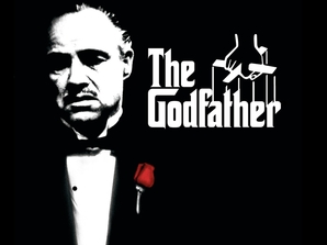
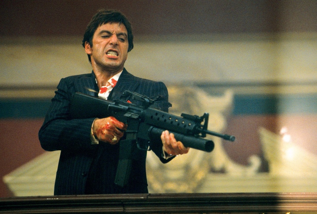
I believe that the theift in my opening sequence sets up the rest of my film because i believe it gives you a sneak peak into certain characters skill set. Also by using the darker colour for my character that does turn on the group, i believe that this may spark suspicion early. The genre of my opening sequence is crime drama however i believe my opening sequence defys typical conventions as it is quite up beat and not as serious as other crime drama films like the god father and scarface.
|
|
 RSS Feed
